You don’t have to be a Retail Design guru to let the personality of your shop shine through. Just remember that every detail is significant, no matter how small. And when making decisions, use any means necessary. Even toilet paper, as demonstrated by our retail design expert Thibaut Surin.
1) Pay attention to your window: The devil is in the detail
Your window is a bit like a front cover. If the title leaves you confused, you are unlikely to be inspired to read the book.
So don’t let passers by skip your chapter! When creating a window display, the same rules apply as when editing a text: avoid stylistic errors and focus on the message you want to get across.
While a full window display gives a feeling of completeness, product overload can sometimes give passers by the impression of low quality. This is why jewellers generally opt for a pared back display, placing the spotlight on their goods and allowing them to shine.
A story which unfolds with each chapter. Adapt your window to the changing seasons; regularly change the display to give your business a dynamic image and create a fresh impression.
Finally, bear in mind that passers by are generally on foot. Your products should therefore be displayed at head height – between 1.55 m and 1.80 m.
“A business owner came to me because her sales figures were falling and she didn’t know what to do. Her window was well presented, tastefully decorated, and appropriate for the season. But the pavement in front of her shop had recently been widened, meaning that customers were passing her business without seeing it”.
Thibaut’s Tip: I invited the jeweller to step out of her shop and put herself in the customer’s shoes. Stepping back allowed the owner of the business to come to the following realisation: the placement of goods was too horizontal, making the product practically invisible. A simple step, but something you must bear in mind.
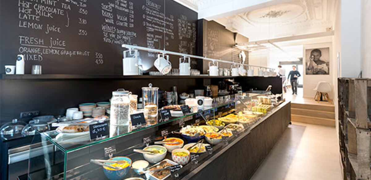
2) Organise your space: Roll out the red carpet
Already have an enviable window display? Good job! But don’t lose your upper hand; now you need to maintain visual coherence between the shop and the window. The common thread, so important in literature, also applies to Retail Design.
In marketing jargon, this means that the customer must be able to easily locate the items displayed in the window within the shop. You wouldn’t interrupt a reader mid-sentence, so don’t stop your customers in their tracks. If they have made the effort to walk through the door, they will feel frustrated, or even ripped off, if they can’t find the item they want.
Inside the shop, play with space and decor to continue the effect created by the window. Place products displayed in the window at the centre of your shop, or in the background, in order to give your customer a full view of what you have to offer.
The use of space within the shop will define the success or failure of your business. For help creating the best layout for your shelves, stands and displays, ask Thibaut Surin or one of our creatives, listed at the end of this article!
“A business owner had purchased a street corner premises, with two windows, for her beauty salon. Given the nature of the space, she was having difficulty organising the partitions which she needed to give her clients privacy”.
Thibaut’s Tip: When I visited, the premises was empty; the only tools we had were our sweaters and my rucksack. I asked the owner of the business to get a roll of toilet paper, which we used to mark the layout! It was exactly the same width as the partitions to be built, and the beautician was able to visualise the space they would occupy clearly. Use whatever you have to hand…
3) Dare to use colour: Make an impact
Everyone knows that colour is powerful: black is slimming, white is calming, red gives a feeling of warmth. But this magic goes even further. Is the ceiling too high? Paint it a dark colour which overlaps onto the walls, creating the illusion that the room has the dimensions you want. Is the space too narrow? Apply a warm, dark colour to the narrow walls and a pale, cold colour to the longer walls. ABRACADABRA!
Of course the trend is for brilliant white. While it makes furnishings stand out and creates a timeless look, white must be absolutely spotless. It requires regular upkeep and frequent refreshing.
Dare to use colour! By using vivid hues, you stimulate the customer’s brain, while using pastel shades creates a calming and relaxing effect. So take out your pencils and pens and design a cover for your novel.
“One client got in a muddle choosing colours for her food business. She didn’t want to settle for the “usual” pallette, but she didn’t want to take too many risks”.
Thibaut’s Tip: I asked the owner of the business to choose an image in colours which she believed summed up the atmosphere of her business. Finally, she opted for a photo of a young woman in a yellow jacket on the edge of a forest. All of the colours in the shop were taken from this image: forest green for the walls, wooden furniture and pale yellow for accessories. A true success story!
4) Flick the switch: the Abercrombie effect
Businesses very rarely change the lighting of their premises during the refit. However, this detail makes a huge difference. In Retail Design, there are different types of lighting:
· General/ambiant lighting: provides the basic lighting.
· Mood lighting: gives the shop atmosphere and highlights its character, using additional lamps, wall lighting, etc.
· Accent/functional lighting: gives volume to a product which you want to highlight, using a directional beam to draw attention to it.
A simple choice of LED colour can turn your shop into an intimate boudoir…or the stairwell of a multi-storey carpark.
A high profile example of this is Abercrombie, a brand which has made customer experience its main selling point. Going against the grain of other large brands and their sometimes oppressive brightness, the American brand decided to give its young customers precisely the opposite, immersing them in a studied twilight. Here and there, directional lighting illuminates a key product, giving excited customers the impression of stepping into a trendy nightclub (a feeling created by the long queues to get in and the booming music).
A wise marketing strategy, lower electricity bills and guaranteed attention! But always think twice about the lighting for your business; whether bright or subdued, never forget that you’ll have to spend all day there…
Remember one golden rule: lighting cannot illuminate a void. So take care not to waste a single beam.
“A grocer complained that his business lacked warmth. However, the fruits and vegetables were perfectly arranged and polished to perfection, and the shelves were clean and well laid out. Another grocer two streets away from his own also seemed far more attractive. But why?“
Thibaut’s Tip: I went and took a photo of the much admired business. Then I explained to the grocer why it appealed to him so much: the shop, which was, overall, traditional, had carefully considered and focused lighting, creating a warm and welcoming atmosphere. His grocery, on the other hand, still used 1970s lighting, which created menacing shadows on the shelves and gave the shop a cold and sterile appearance.
5) Think about your visual identity: Pinterest is your friend
At a time of product homogenisation, the uniqueness of your business is a major selling point. So let’s get to work!
Firstly, you must define the visual identity of your shop. This must enable people to recognise your business and make it unique in the eyes of the consumer. It is formed of a series of unique graphic motifs, which create a coherent and recognisable whole.
The graphic charter that includes all of the constituent parts of this identity (logo, typeface, colour pallette), allows you to transfer it into any medium. Have you screwed up page after page in search of the perfect logo? STOP. Yes, originality is a good thing. But not if it distorts the identity of your business. Rather than killing any more trees, go and look what’s already out there!
This technique is not cheating- it even has a name: benchmarking. In marketing, this means studying and analysing your competitors and similar businesses, drawing inspiration from them and using it to your advantage.
There’s no point reinventing the wheel. Nobody tells us that customers prefer warm, neutral tones for organic grocers; certain codes have already been taken on board by shoppers; use them for inspiration! And in this quest, Pinterest is your greatest ally.
“A business owner was lacking inspiration when developing a graphic charter. However, the business had a strong character, offering natural produce, with an exotic touch”.
Thibaut’s Tip: Don’t make life difficult! Every aspect of your graphic charter is hidden between the lines of your business plan. Take cues from your product when creating a visual identity for your business. Natural produce? Relaxed atmosphere? Opt for a clean, simple typeface on kraft or recycled paper.
Ready to work with our creatives?
Want to join our creative database.
Join Thibaut Surin via tsurin@hub.brussels